The most common mistake on newsletter landing pages? Not considering first-time visitors. You know exactly what you’re offering—but new visitors don’t. If your copy doesn’t clearly explain the benefits, people won’t subscribe.
So ask yourself: What would a first-time visitor need to see or read to be persuaded to sign up? When you shift the focus from you to them, that’s when things change.
To help you get better results, here are 10 actionable steps to improve your newsletter landing page—with real examples included. Once you’re done, use the accompanying Newsletter Landing Page Checklist to double-check your work.
1. Add Personality to Your Copywriting
Your headline is the first thing people read—followed by the subtext. Both need to grab attention. With thousands of newsletters out there, what makes yours different is you. A bit of personality or humor goes a long way.
Example: Damp’s landing page
Headline:
No wine news
A newsletter without added sulfites
Subtext:
No news, reviews, interviews
Highlighting places to visit, bottles to drink, and events to attend. We tell the stories of honest people in wine who are dedicated to a better process.
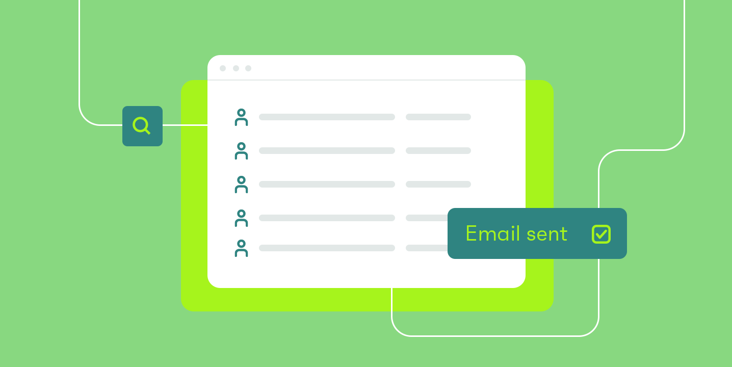
2. Embed the Sign-Up Form In-Page
Avoid sending users to another page. Each extra click reduces conversions.
Bad: Click here to subscribe
Better: (Email input) + Subscribe on the same page
3. Position the Form Above the Fold
Place the sign-up form where it’s immediately visible—without scrolling.
Example: The Lazy NBA newsletter puts the form right at the top. Make it effortless to subscribe.
4. Spice Up the Call-to-Action Button
“Submit” is boring. Use engaging CTAs instead.
Try:
- Subscribe Free
- Get Involved
- Unlock the Secrets
- Start Learning Guitar
5. Add Subtext Below the Form
Build trust by being transparent.
Bland: We respect your privacy
Better: The Hiking Gear newsletter sends every 2 weeks. No more. No less. Unsubscribe instantly at any time.
6. Include a Testimonial That Highlights Real Value
Not all testimonials are created equal. Avoid vague praise.
Weak: I just love this newsletter
Stronger: The Hiking Gear newsletter is packed with useful tips I take into every adventure.
You can also use social proof (like pop-ups showing recent sign-ups) to build trust.
7. Preview the Email
Show, don’t just tell. Add a visual preview of what subscribers will receive.
Example: On One Page Love, the Landing Page Hot Tips email drip includes a mock-up of an actual email.
8. Declutter the Page
Focus on the one goal: collecting an email address.
Remove:
- Navigation menus
- Social media links
- Other product links
- Empty testimonials
- Fluff content
Less is more.
9. Test the Mobile Experience
A huge percentage of visitors come from mobile. Optimize for them.
Tips:
- Remove large images that slow load time
- Use smaller fonts
- Keep CTA buttons visible without scrolling
Make the mobile sign-up as frictionless as possible.
10. Answer the “Why”
Why did you start this newsletter? What makes it matter?
When you share your personal motivation, people connect with you and your journey. That emotional connection can turn a visitor into a loyal subscriber.
Want more tips like these? Check out Landing Page Hot Tips—Rob Hope’s guide to crafting high-converting pages.